
Unleashing the Power of Data Storytelling: Engaging Audiences with Numbers
In today’s data-driven world, businesses and organisations constantly swim in a sea of data. However, raw data alone can be overwhelming and challenging to comprehend for most people. That’s where the art of data storytelling comes into play. By weaving a narrative around data and statistics, businesses can captivate their audiences, make complex information accessible, and drive more persuasive decision-making. In this blog, we’ll explore the concept of data storytelling and present real-world examples that demonstrate its effectiveness in various contexts.
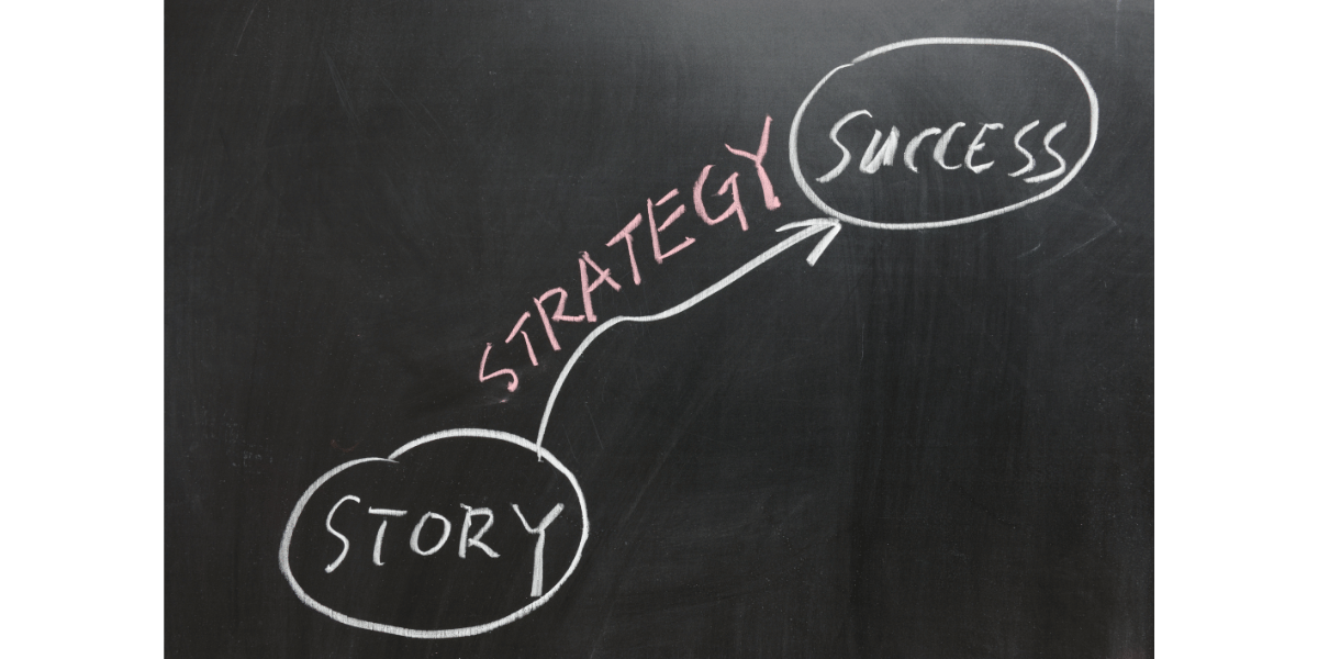
Storytelling through Data in Business Presentations
Imagine attending a business conference where a company presents its annual performance using a long list of charts and graphs. The data may be accurate, but it needs more power to engage the audience truly. Now, envision the same data presented as a story:
- Starting with the company’s challenges
- Detailing the actions taken
- Culminating in the remarkable achievements
By contextualising the data, the audience can grasp the impact of each data point, making the presentation more memorable and compelling.
Example
The multinational retailer Walmart uses data storytelling in its quarterly earnings presentations. Rather than solely focusing on financial figures, the presentations include anecdotes about store expansions, customer satisfaction improvements, and initiatives that resulted in measurable outcomes. This approach helps stakeholders connect emotionally with the data, understand the company’s progress, and visualise its future direction.
Data Storytelling in Reports
Reports are essential tools for conveying data-backed insights, but without the storytelling element, they risk being dull and difficult to digest. Data storytelling transforms a report from a dry compilation of figures into a compelling narrative that engages readers and drives them to take action.
Example
The World Health Organisation (WHO) often publishes reports on global health issues. In their information on the progress towards eradicating malaria, they use storytelling to showcase the impact of interventions, share success stories from different regions, and highlight the challenges that still need to be addressed. By presenting the data within these narratives, the WHO effectively communicates the urgency of the issue and the significance of continued efforts.
To see the examples in action, navigate to the The World Health Organisation (WHO) site here.
Infographics: Visualising Data Stories
Infographics are a powerful way to combine data and storytelling, providing a visually appealing and concise format to communicate complex information. Infographics leverage storytelling elements like flow, progression, and visual cues to guide the audience through the data.
Example
The New York Times created an infographic to showcase the changing trends in music consumption over the years. By presenting data on the evolution of music formats alongside major historical events, the infographic tells a story of how music preferences have shifted, giving readers a deeper understanding of the cultural impact of music.
Social Impact and Nonprofit Organisations
Nonprofit organisations often rely on data storytelling to demonstrate the impact of their initiatives and attract support from donors and volunteers. By presenting data in the context of real-life stories, these organisations can illustrate how their work is making a positive difference in the lives of individuals and communities.
Example
The charity organisation Oxfam publishes annual reports combining data and personal narratives to showcase their efforts to fight poverty and inequality worldwide. Through storytelling, Oxfam highlights the challenges faced by marginalised communities and the transformative outcomes achieved through their programs, such as access to clean water, education, and sustainable livelihoods.
To see the examples in action, navigate to the Oxfam site here.

Environmental Conservation Efforts
Environmental organisations frequently use data storytelling to raise awareness about environmental issues, the impact of human activities on the planet, and the importance of conservation efforts. These organisations can mobilise support for sustainable practices and policies by presenting scientific data in a compelling narrative.
Example
The World Wildlife Fund (WWF) employs data storytelling in its reports on wildlife populations and biodiversity. These reports integrate data on endangered species’ populations with stories of conservation efforts, challenges faced in protecting habitats, and success stories of species recovery. This approach helps readers understand the urgency of preserving biodiversity and the tangible results of conservation initiatives.
To see the examples in action, navigate to the WWF site here.
Final Thoughts
Data storytelling is a skill that can transform how businesses communicate with their audiences, making data more relatable and actionable. By incorporating narratives into presentations, reports, and infographics, companies can engage stakeholders, inspire action, and drive meaningful decision-making.
Remember that compelling data storytelling requires a balance between data accuracy and the art of storytelling. Data storytelling can be a game-changer in influencing opinions, driving change, and enhancing overall business success in our data-driven world. So, start harnessing the power of data storytelling to elevate your organisations data-driven communication to new heights.


You May Also Like

Understanding OKRs: A Simple Guide with Everyday Examples

Navigating the AI Galaxy: A Product Leader’s Guide to Crafting Intelligent Solutions